Animation Packages
flutter_animate
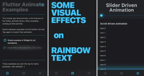
Flutter Animate is a library that makes it simple to add almost any kind of animated effect in Flutter. The library comes with a variety of pre-built effects, like fade, scale, slide, blur, shake, shimmer, and color effects (saturation and tint), that can be easily added to your app.
In addition, Flutter Animate simplifies the process of creating custom animated builders, making it easy to synchronize animations with scroll events, notifiers, or anything else. With its unified API and integrated events, Flutter Animate is the ideal solution for your animation needs.
curved_navigation_bar
The new curved navigation bar is a stunning addition to any mobile apps. You can adjust its color, background and animation curve for your desired look! It even comes with customizable animations that will suit you perfectly so don’t miss out on this one!
simple_animations
Animations are a great way to add style and animation into your app. With simple_animations, you can create custom animations in no time! No need for stateful widgets or complicated code – just select properties from the widget that will be animated then click “Animate.”
You’ll have access not only standard start/finish states but also different fade-in/out speeds depending what effect (elegance) best applies here.
shimmer_animation
The shimmer animation package does an excellent job at loading your screens with a playful flair. Equip your project with this skeleton loader widget to make the animations as whimsical as you desire.
Shimmer is very popular among developers as the default animation for skeleton loaders and placeholder widgets. As a result, having an easy-to-use, yet modifiable widget accessible for Android, iOS, and the Web gives developers a leg up by allowing them to focus on their actual functionality rather than the loading process.
flutter_sequence_animation
With this library, you may combine any animation with the versatile and easy-to-use animations.
There is no need to use intervals or calculations of percentages. Animate the same variable with more than one animatable! You only need one AnimationController. The interface is intuitive and easy to use.
animated
Animated is a very simple (but powerful) animation library for Flutter. It can create an animation from one value to another when you do not need to use an AnimatedContainer.
spring
The Spring Flutter animation kit is a powerful, yet simple prebuilt package for developers who want to build faster apps.
animated_text_kit
This library contains a collection of some cool and awesome text animations. It supports Rotate, Fade, Typer, Typewriter, Scale, Colorize, TextLiquidFill, Wavy, Flicker, and custom Animations.